Travel Patterns
manhattan_rides_df <- read_csv("manhattan_rides.csv")

manhattan_rides_df <-
  manhattan_rides_df %>%
  mutate(
    day_of_week = factor(day_of_week, ordered = T,
                         levels = c("Sun", "Mon", "Tue", "Wed", "Thu", "Fri", "Sat")),
    year = factor(year),
    age_group = factor(age_group, ordered = T,
                       levels = c("18-25","26-35", "36-45", "46-55", "56-65", "66-85"))
  )
Rides by Day of Week
manhattan_rides_df %>%
  group_by(day_of_week, year) %>%
  summarize(obs = n()) %>%
  ggplot(aes(x = day_of_week, y = obs, group = year, color = year)) +
  geom_point() +
  geom_line() +
  labs(x = "Day of the Week", y = "Number of Rides", col = "Year") +
  ggtitle("Citibike Rides by Day of the Week") +
  theme(plot.title = element_text(hjust = 0.5))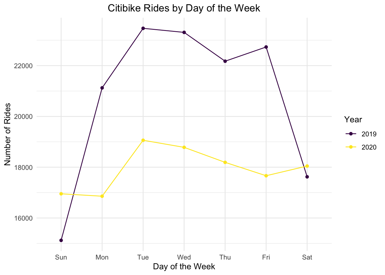
The number of rides per day was higher in 2019 during the week than in 2020, likely due to the shift to working from home in 2020. Interestingly, there were slightly more rides on the weekends in 2020, likely because of a predisposition to use biking as a mode of transportation, rather than subways, during COVID-19 due to avoidance of crowds.
Monthly Destinations in 2019 vs. 2020
hubs_df =
  read_csv("hubs.csv") %>%
  drop_na()

hospitals_df =
  read_csv("hospitals.csv") %>%
  drop_na()
The following is a side by side comparison of monthly rides in 2019 and 2020. Hospitals are marked with red dots and financial hubs are marked with green dots.
nyc =
  as_tibble(
    map_data("state")
  ) %>%
  filter(subregion == "manhattan")

bikes_month_2019 = manhattan_rides_df %>%
  filter(year == "2019") %>%
  mutate(
    month = format(starttime, format = "%m"),
    month = as.numeric(month)
  ) %>%
  group_by(month, end_station_longitude, end_station_latitude) %>%
  summarise(n_rides = n())

bikes_month_2020 = manhattan_rides_df %>%
  filter(year == "2020") %>%
  mutate(
    month = format(starttime, format = "%m"),
    month = as.numeric(month)
  ) %>%
  group_by(month, end_station_longitude, end_station_latitude) %>%
  summarise(n_rides = n())

map_month_2019 =
  ggplot() +
  geom_polygon(data = nyc, aes(x = long, y = lat, group = group), fill = "grey", alpha = 0.5) +
  geom_point(data = bikes_month_2019, aes(x = end_station_longitude, y = end_station_latitude, size = 0.25, color = n_rides), alpha = 0.5) +
  scale_size(range = c(1,8), name = "Rides") +
  geom_point(data = hospitals_df, aes(x = Long, y = Lat), color = "red") +
  geom_point(data = hubs_df, aes(x = Long, y = Lat), color = "green") +
  transition_time(month) +
  labs(
    title = "2019 Month: {frame_time}",
    color = "Rides",
    x = "Longitude",
    y = "Latitude") +
  enter_grow() +
  exit_shrink() +
  ease_aes("sine-in-out") +
  coord_cartesian(ylim = c(40.68, 40.85), xlim = c(-74.02, -73.925))


map_month_2020 =
  ggplot() +
  geom_polygon(data = nyc, aes(x = long, y = lat, group = group), fill = "grey", alpha = 0.5) +
  geom_point(data = bikes_month_2020, aes(x = end_station_longitude, y = end_station_latitude, size = 0.25, color = n_rides), alpha = 0.5) +
  scale_size(range = c(1,8), name = "Rides") +
  geom_point(data = hospitals_df, aes(x = Long, y = Lat), color = "red") +
  geom_point(data = hubs_df, aes(x = Long, y = Lat), color = "green") +
  transition_time(month) +
  labs(
    title = "2020 Month: {frame_time}",
    color = "Rides",
    x = "Longitude",
    y = "Latitude") +
  theme(legend.position = "none") +
  enter_grow() +
  exit_shrink() +
  ease_aes("sine-in-out") +
  coord_cartesian(ylim = c(40.68, 40.85), xlim = c(-74.02, -73.925))

#combining both animations using magick package
a_month_gif = animate(map_month_2019, duration = 12, fps = 1, width = 400, height = 400)
b_month_gif = animate(map_month_2020, duration = 12, fps = 1, width = 400, height = 400)

a_month_mgif = image_read(a_month_gif)
b_month_mgif = image_read(b_month_gif)

new_month_gif = image_append(c(a_month_mgif[1], b_month_mgif[1]))
for (i in 2:12) {
  combined_month = image_append(c(a_month_mgif[i], b_month_mgif[i]))
  new_month_gif = c(new_month_gif, combined_month)
}

new_month_gif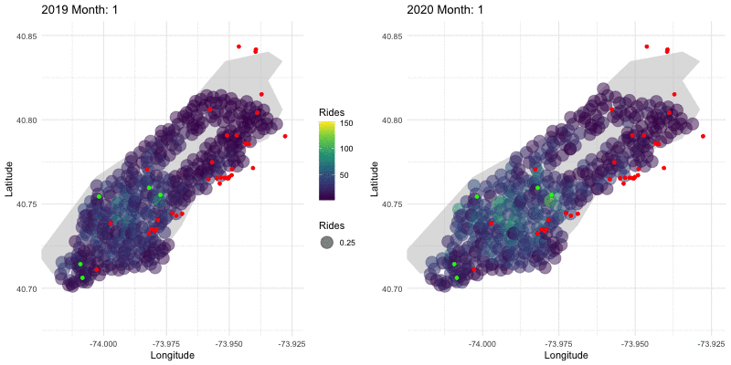
In mid-2020, Citi Bike expanded stops into northern Manhattan, driving the expansion of the bubble graph area seen in late-2020. We can see that 2020 started off with more rides than 2019, but then decreased significantly in March. Ridership numbers recovered a bit later in the year, but not quite to 2019 levels.
Daily Destinations in 2019 and 2020 in Lower Manhattan
bikes_2019 = manhattan_rides_df %>%
  filter(year == "2019") %>%
    group_by(stop_date, end_station_longitude, end_station_latitude) %>%
  summarise(n_rides = n()) %>%
  mutate(
    date = paste0("2019-", stop_date),
         date = as.Date(date, "%Y-%m-%d"))

bikes_2020 = manhattan_rides_df %>%
  filter(year == "2020") %>%
    group_by(stop_date, end_station_longitude, end_station_latitude) %>%
  summarise(n_rides = n()) %>%
  mutate(
    date = paste0("2020-", stop_date),
         date = as.Date(date, "%Y-%m-%d"))

timeline_2019 =
  bikes_2019 %>%
  filter(date >= as.Date("2019-02-16"), date <= as.Date("2019-06-30"))

timeline_2020 =
  bikes_2020 %>%
  filter(date >= as.Date("2020-02-16"), date <= as.Date("2020-06-30"))

daily_map_2019 =
  ggplot() +
  geom_polygon(data = nyc, aes(x = long, y = lat, group = group), fill = "grey", alpha = 0.5) +
  geom_point(data = timeline_2019, aes(x = end_station_longitude, y = end_station_latitude, size = 0.25, color = n_rides), alpha = 0.5) +
  geom_point(data = hospitals_df, aes(x = Long, y = Lat), color = "red") +
  geom_point(data = hubs_df, aes(x = Long, y = Lat), color = "green") +
  transition_time(date) +
  labs(
    title = "Date: {frame_time}",
    color = "Rides",
    x = "Longitude",
    y = "Latitude") +
  scale_fill_continuous(breaks = c(2.5, 5.0, 7.5, 10.0, 12.5)) +
  enter_grow() +
  exit_shrink() +
  ease_aes("sine-in-out") +
  coord_cartesian(ylim = c(40.725, 40.775), xlim = c(-74.0125, -73.925))

daily_map_2020 =
  ggplot() +
  geom_polygon(data = nyc, aes(x = long, y = lat, group = group), fill = "grey", alpha = 0.5) +
  geom_point(data = timeline_2020, aes(x = end_station_longitude, y = end_station_latitude, size = 0.25, color = n_rides), alpha = 0.5) +
scale_fill_continuous(limits = c(0,12.5), breaks = c(0, 2.5, 5.0, 7.5, 10.0, 12.5)) +
  geom_point(data = hospitals_df, aes(x = Long, y = Lat), color = "red") +
  geom_point(data = hubs_df, aes(x = Long, y = Lat), color = "green") +
  transition_time(date) +
  labs(
    title = "Date: {frame_time}",
    color = "Rides",
    x = "Longitude",
    y = "Latitude"
    ) +
  theme(legend.position = "none") +
  enter_grow() +
  exit_shrink() +
  ease_aes("sine-in-out") +
  coord_cartesian(ylim = c(40.725, 40.775), xlim = c(-74.0125, -73.925))

#combining both animations using magick package
a_daily_gif = animate(daily_map_2019, duration = 30, fps = 2, width = 400, height = 400)
b_daily_gif = animate(daily_map_2020, duration = 30, fps = 2, width = 400, height = 400)

#combining both animations using magick package
a_daily_gif = animate(daily_map_2019, duration = 30, fps = 2, width = 400, height = 400)
b_daily_gif = animate(daily_map_2020, duration = 30, fps = 2, width = 400, height = 400)

a_daily_mgif = image_read(a_daily_gif)
b_daily_mgif = image_read(b_daily_gif)

new_daily_gif = image_append(c(a_daily_mgif[1], b_daily_mgif[1]))
for (i in 2:60) {
  combined_daily = image_append(c(a_daily_mgif[i], b_daily_mgif[i]))
  new_daily_gif = c(new_daily_gif, combined_daily)
}

new_daily_gif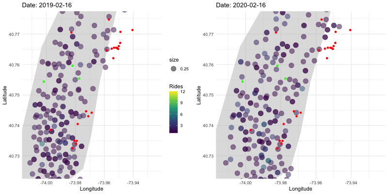
This graph displays the daily ridership in 2019 vs 2020 for Lower Manhattan. Even more than in the monthly graph above, this makes apparent how drastically the usage of CitiBikes dropped in late-March 2020 compared to 2019. The areas of the city that were still utilized during this drop tended to be near either financial hubs or hospitals, marked with green or red dots respectively.
Shiny App: Common Rides to Manhattan Locations:
We were also interested in common travel patterns around Manhattan from 2019-2020. To examine this, we selected 16 locations from around Manhattan and found the nearest CitiBike station to that location. Then, we summarized the data to find the number of trips that start at one station and then end at the stations closest to the Manhattan locations. Next, we filtered the data to show only the most common trip that end at each of the 16 CitiBike stations for our 16 locations (in the event of a tie, we select the start station that’s furthest away from the end station of interest). Then, we also determined the average age of a rider ending their trips at those 16 destinations.
We created a shiny app to visualize the journeys to various Manhattan locations, which you can view here.
# manhattan_stations_upd filters out any citi bike station that appears more than once
# (i.e. some stations with the same id have slightly different coordinates and thus appear
# multiple times)
manhattan_stations_upd <-
  manhattan_stations %>%
  group_by(id) %>%
  mutate(
    num_rep = row_number()
  ) %>%
  ungroup() %>%
  filter(num_rep == 1) %>%
  select(!num_rep)

# manhattan_rides_diff filters out manhattan_rides so we're only looking at rides
# that start and end at different stations
manhattan_rides_diff <-
  manhattan_rides %>%
  filter(start_station_id != end_station_id)

# the closest_station_info_fn takes in vectors of latitude and longitude
# and returns a tibble where we get for each nyc location
# the geographic info for the closest end_station
# the geographic info for the most common start_station for trips ending at that end_station
# the average age of riders for trips ending at that end_station
# the average trip duration for trips ending at that end_station
closest_station_info_fn <- function(nyc_lat, nyc_long) {

  station <-
    manhattan_stations_upd %>%
    mutate(
      distance =
        (geodist_vec(
          x1 = rep(nyc_long, nrow(manhattan_stations_upd)),
          y1 = rep(nyc_lat, nrow(manhattan_stations_upd)),
          x2 = longitude,
          y2 = latitude,
          paired = T,
          measure = "vincenty"
        ) * 3.281)
    ) %>%
    slice_min(order_by = distance)

  start_station_popular <-
    manhattan_rides_diff %>%
    filter(end_station_id %in% pull(station, id)) %>%
    group_by(start_station_id, start_station_name, start_station_latitude, start_station_longitude) %>%
    summarize(
      total_trips = n()
    ) %>%
    ungroup() %>%
    slice_max(order_by = total_trips)

  avg_table <-
    manhattan_rides_diff %>%
    filter(
      end_station_id %in% pull(station, id)
    ) %>%
    group_by(end_station_id, end_station_name, end_station_latitude, end_station_longitude) %>%
    summarize(
      avg_age = mean(age)
    ) %>%
    ungroup() %>%
    bind_cols(
      start_station_popular
    ) %>%
    rename_with(~str_replace(., "^end_station_", "end_")) %>%
    rename_with(~str_replace(., "^start_station_", "start_")) %>%
    select(!total_trips) %>%
    relocate(avg_age, .after = start_longitude)

  return(avg_table)

}

# in the event there are ties for most common start_station for a particular end_station
# we take the start_station that is furthest from the end_station
# we also add a variable 'mi_from_end' that tells how many miles the destination is from the end_station
nyc <-
  nyc_locations %>%
  mutate(
    closest_station_info = map2(.x = location_lat, .y = location_long, .f = closest_station_info_fn)
  ) %>%
  unnest(closest_station_info) %>%
  mutate(
    distance_to_start = geodist_vec(
      x1 = start_longitude,
      y1 = start_latitude,
      x2 = end_longitude,
      y2 = end_latitude,
      paired = T,
      measure = "vincenty"
    ),
    location = factor(location)
  ) %>%
  group_by(location) %>%
  slice_max(order_by = distance_to_start) %>%
  select(!distance_to_start) %>%
  ungroup()

nyc_choices <-
  nyc_locations %>%
  pull(location)

### Shiny app stuff
ui <-
  fluidPage(
    titlePanel("Visualizing Trips to Manhattan Destinations"),
    sidebarLayout(
      sidebarPanel(
        selectInput(
          "site_choice",
          label = h4("Select your destination:"),
          choices = nyc_choices
        ),
        width = 3
      ),
      mainPanel(
        leafletOutput("manhatttan_map"),
        br(), br(),
        plotOutput("lollipop_plot")
      )
    )
  )
server <- function(input, output) {
  output$manhatttan_map <- renderLeaflet({

    nyc_site <-
      nyc %>%
      filter(
        location == input[["site_choice"]]
      )

    bike_icons <- awesomeIconList(
      red_bike   = makeAwesomeIcon(icon = 'bicycle', markerColor = 'red', iconColor = 'black', library = "fa"),
      green_bike = makeAwesomeIcon(icon = 'bicycle', markerColor = 'green', iconColor = 'black', library = "fa")
    )

    city_icons <- awesomeIconList(
      city_pic = makeAwesomeIcon(icon = 'building', markerColor = 'white', iconColor = 'black', library = "fa")
    )

    gcIntermediate(
      c(nyc_site$end_longitude[[1]], nyc_site$end_latitude[[1]]),
      c(nyc_site$start_longitude[[1]], nyc_site$start_latitude[[1]]),
      n = 100,
      addStartEnd = TRUE,
      sp = TRUE
    ) %>%
    leaflet() %>%
      addAwesomeMarkers(lng = nyc_site$end_longitude[[1]],
                        lat = nyc_site$end_latitude[[1]],
                        popup = str_c("You parked at the ", nyc_site$end_name[[1]], " station"),
                        icon = bike_icons[["red_bike"]]
      ) %>%
      addAwesomeMarkers(lng = nyc_site$start_longitude[[1]],
                        lat = nyc_site$start_latitude[[1]],
                        popup = str_c("You started at the ", nyc_site$start_name[[1]], " station"),
                        icon = bike_icons[["green_bike"]]
      ) %>%
      addAwesomeMarkers(lng = nyc_site$location_long[[1]],
                        lat = nyc_site$location_lat[[1]],
                        popup = str_c("Your destination: ", nyc_site$location[[1]]),
                        icon = city_icons[["city_pic"]]
      ) %>%
      addProviderTiles("CartoDB.Positron") %>%
      addPolylines()

  })

  output$lollipop_plot <- renderPlot({

    input[["site_choice"]]

    without_choice <-
      nyc %>%
      filter(
        location != input[["site_choice"]]
      ) %>%
      mutate(
        location = fct_reorder(location, avg_age)
      )

    choice_only <-
      nyc %>%
      filter(
        location == input[["site_choice"]]
      )

    without_choice %>%
      ggplot(aes(x = avg_age, y = location)) +
      geom_segment(aes(x = choice_only$avg_age[[1]], xend = avg_age, y = location, yend = location), color = "grey") +
      geom_point(
        color = ifelse(without_choice$avg_age > choice_only$avg_age[[1]], "blue", "red"),
        size = 4
      ) +
      geom_vline(xintercept = choice_only$avg_age[[1]]) +
      theme_light() +
      theme(
        panel.grid.major.y = element_blank(),
        panel.border = element_blank(),
        axis.ticks.y = element_blank()
      ) +
      xlab("") + ylab("")

  })

}

shinyApp(ui = ui, server = server)
To interact with this app:
Select a Manhattan location, and watch how both the map and plot below it change.
The red icon represents the bike station closest to the Manhattan destination you selected.
The green icon represents the bike station where most trips ending at the station near your destination begin.
The building icon represents the destination you selected.
Click on the map icons to learn more.
Note how the average age of riders compared to the selected destination changes in the lollipop plot under the map.
These paths between stations are just there to give you an idea of the distance between stations and relative to the destination. They are not recommended paths (please - don’t try to ride through the Central Park reservoir)