Commuting Services
CitiBike Memberships Purchased by Month in NYC and New Jersey City
measures_of_interest %>%
  ggplot(aes(x = date, y = count)) +
  geom_line(aes(group = measure, color = measure)) +
  geom_point(aes(group = seq_along(date), color = measure)) +
  transition_reveal(date) +
  scale_x_date(breaks = "4 months", labels = date_format("%b-%Y")) +
  scale_colour_discrete(name = "Membership Type",
                        breaks = c("ct_annual_members", "ct_single_day_passes",
                                   "ct_single_trip_passes"),
                        labels = c("Annual Passes Renewed or Purchased",
                                   "Single-Day Passes Purchased",
                                   "Single-Trip Passes Purchased")) +
  labs(x = "Date", y = "Count") +
  ggtitle("CitiBike Memberships Purchased by Month in NYC and New Jersey City") +
  theme_minimal() +
  theme(legend.position = "bottom") +
  guides(color = guide_legend(nrow = 2, byrow = TRUE)) +
  theme(axis.text.x = element_text(angle = 90, vjust = 0.5, hjust = 1))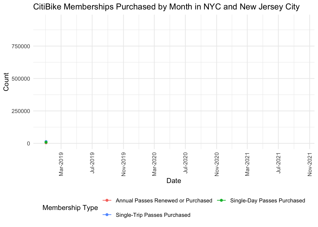
This animated graph displays changes in CitiBike annual passes, single-day passes, and single-trip passes from January 2019 through November 2021 (when we last pulled these reports). As seen by this graph, spikes in membership tend to occur in summer months. During the COVID-19 pandemic, there was a major spike in all forms of CitiBike memberships from April 2020 through August 2020, and this spike was most significant for single-trip purchases. Another even more significant spike occurred from May 2021 through August 2021.
Ridership Transit System Percent Change Following COVID
manhattan_rides_df <- read_csv("manhattan_rides.csv")
manhattan_rides_df <-
  manhattan_rides_df %>%
  mutate(
    day_of_week = factor(day_of_week, ordered = T,
                         levels = c("Sun", "Mon", "Tue", "Wed", "Thu", "Fri", "Sat")),
    year = factor(year),
    age_group = factor(age_group, ordered = T,
                       levels = c("18-25","26-35", "36-45", "46-55", "56-65", "66-85")),
    gender = type.convert(gender, as.is = F))
citi_pc_change =
manhattan_rides_df %>%
mutate(date = format(stoptime, format = "%m-%d-%Y")) %>%
group_by(stop_date, year) %>%
summarize(daily_rides = n()) %>%
ungroup() %>%
group_by(stop_date) %>%
arrange(year, .by_group = T) %>%
mutate(percent_change = (daily_rides/lag(daily_rides) - 1) * 100) %>%
filter(year == 2020) %>%
select(date = stop_date, percent_change) %>%
mutate(transit_system = "citi_bike",
date = paste0("2020-", date),
date = as.Date(date, "%Y-%m-%d"))#Ridership data for 2019/2020 Manhattan
turnstiles_2019_m = read_csv("2019-turnstile.csv") %>%
filter(borough == "M") %>%
mutate(gtfs_latitude = as.numeric(gtfs_latitude),
gtfs_longitude = as.numeric(gtfs_longitude))
turnstiles_2020_m = read_csv("2020-turnstile.csv") %>%
filter(borough == "M") %>%
mutate(gtfs_latitude = as.numeric(gtfs_latitude),
gtfs_longitude = as.numeric(gtfs_longitude))
turnstiles_19_20_m = rbind(turnstiles_2019_m, turnstiles_2020_m)
#Ridership data 3/1/2020 - today
ridership_covid_changes = read_csv("covid-ridership.csv") %>%
janitor::clean_names() %>%
mutate(date = as.Date(date, "%m/%d/%Y")) %>%
rename(buses_ter = buses_total_estimated_ridership) %>%
rename(lirr_ter = lirr_total_estimated_ridership) %>%
rename(metro_north_ter = metro_north_total_estimated_ridership) %>%
rename(subways_ter = subways_total_estimated_ridership) %>%
rename(subways_pc = subways_percent_change_from_pre_pandemic_equivalent_day) %>%
rename(metro_north_pc = metro_north_percent_change_from_2019_monthly_weekday_saturday_sunday_average) %>%
rename(lirr_pc = lirr_percent_change_from_2019_monthly_weekday_saturday_sunday_average) %>%
rename(buses_pc = buses_percent_change_from_pre_pandemic_equivalent_day) %>%
rename(bridges_and_tunnels_pc = bridges_and_tunnels_percent_change_from_pre_pandemic_equivalent_day) %>%
rename(access_a_ride_ter = access_a_ride_total_scheduled_trips) %>%
rename(access_a_ride_pc = access_a_ride_percent_change_from_pre_pandemic_equivalent_day)
ridership_covid_changes_2020 = ridership_covid_changes %>%
filter(date <= as.Date('2020-12-31'))
ridership_covid_pc_tidy =
ridership_covid_changes_2020 %>%
select(date, access_a_ride_pc, bridges_and_tunnels_pc, buses_pc, lirr_pc, metro_north_pc, subways_pc) %>%
pivot_longer(
c(access_a_ride_pc:subways_pc),
names_to = "transit_system",
values_to = "percent_change"
) %>%
mutate(transit_system = gsub("_pc", "", transit_system),
percent_change = gsub("%", "", percent_change),
percent_change = as.numeric(percent_change))ridership_pc_change =
bind_rows(ridership_covid_pc_tidy, citi_pc_change)renamed_ridership =
ridership_pc_change %>%
mutate(transit_system = factor(transit_system, levels = c("access_a_ride", "bridges_and_tunnels",
"buses", "citi_bike", "lirr", "metro_north",
"subways"),
labels = c("Access a Ride", "Bridges and Tunnels", "Buses",
"Citi Bike", "Long Island Railroad", "Metro North",
"Subways")))
# Using plotly
renamed_ridership %>%
ungroup() %>%
drop_na() %>%
filter(date >= as.Date('2020-03-01')) %>%
plot_ly(
x = ~date,
y = ~percent_change,
color = ~transit_system,
type = "scatter",
mode = "lines") %>%
layout(
title = "Ridership Transit System Percent Change Following COVID",
xaxis = list(title = "Date"),
yaxis = list(title = "Percent Change")
)This plot shows the percent change in ridership in 2020 compared to 2019 for various transit services across NYC. By this graph we can see that every transit service experienced a drop in ridership in March 2020 compared to 2019 levels, coinciding with the start of lockdown. However, Citi Bike usage recovered and in many cases exceeded its 2019 levels, while all other forms of transit stayed below the usage levels seen in 2019.
Shiny App: Subway Ridership Percent Change from 2019 to 2020:
We wanted to examine how subway ridership changed across locations between 2019 and 2020. Specifically, we looked at entry and exit data from Subway turnstiles to understand where people are going to and coming from throughout the year.
We created a shiny app to visualize subway ridership change from 2019 to 2020, which you can view here.
# Data Loading
## Subway Lines Data
subway_lines = st_read("./data/subway_lines_data/geo_export_cef610e7-3c97-412c-ac0a-44a37bcf4f9b.shp")
subway_lines = st_transform(subway_lines, CRS("+proj=longlat +ellps=GRS80 +datum=WGS84"))

## Turnstile Data
### loading 2019 data
turnstiles_data_2019 = read_csv("./data/2019-turnstile.csv") %>%
    mutate(gtfs_latitude = as.numeric(gtfs_latitude),
           gtfs_longitude = as.numeric(gtfs_longitude),
           borough = recode(borough, Q = "Queens", Bk = "Brooklyn", Bx = "Bronx", M = "Manhattan", SI = "Staten Island"),
           month = format(as.Date(date), "%m"),
           day_month = format(date, "%m/%d")) %>%
    drop_na()

### calculating each stop's monthly average rates in 2019 (pre pandemic)
turnstiles_data_2019_averages =
    turnstiles_data_2019 %>%
    group_by(month, complex_id) %>%
    summarise(avg_exits = mean(exits),
              avg_entries = mean(entries))

### loading 2020 data
turnstiles_data_2020 = read_csv("./data/2020-turnstile.csv") %>%
    mutate(gtfs_latitude = as.numeric(gtfs_latitude),
           gtfs_longitude = as.numeric(gtfs_longitude),
           month = format(as.Date(date), "%m"),
           borough = recode(borough, Q = "Queens", Bk = "Brooklyn", Bx = "Bronx", M = "Manhattan", SI = "Staten Island"),
           day_month = format(date, "%m/%d")) %>%
    drop_na()

### merging 2020 data with the monthly average turnstile usage for 2019 - pre pandemic
total = merge(turnstiles_data_2020, turnstiles_data_2019_averages, by = c("complex_id", "month")) %>%
    mutate(entries_pc = (((entries-avg_entries)/avg_entries)*100),
           exits_pc = (((exits-avg_exits)/avg_exits)*100)) %>%
    mutate(entries_pc = ifelse(entries_pc>100, 100, entries_pc),
           exits_pc = ifelse(exits_pc>100, 100, exits_pc)) %>%
    select(-c(day_month, avg_entries, avg_exits, entries, exits, month))

### creating data for Shiny App
shiny_data = total %>%
    pivot_longer(
        cols = entries_pc:exits_pc,
        names_to = "turnstile_type",
        values_to = "turnstile_count"
    ) %>%
    drop_na()


# Creating Color Pallet
qpal = colorNumeric(palette = "viridis", domain = -100:100)

# Define UI for application
ui <- fluidPage(

    # Application title
    titlePanel("Subway Ridership Percent Change from 2019 to 2020"),

    # Sidebar with a slider input for number of bins
    sidebarLayout(
        sidebarPanel(
            sliderInput("date",
                        h3("Date"),
                        min = as.Date("2020-01-01","%Y-%m-%d"),
                        max = as.Date("2020-12-25","%Y-%m-%d"),
                        value  = as.Date("2020-03-18","%Y-%m-%d"),
                        timeFormat = "%d %b",
                        ticks = FALSE),

            checkboxGroupInput("borough_choice",
                               h3("NYC Borough"),
                               choices = c("Queens", "Brooklyn", "Bronx", "Manhattan", "Staten Island"),
                               selected = "Manhattan"),

            radioButtons("turnstile_type_choice",
                         h3("Turnstile Data"),
                         choiceNames = c("Exits Percent Change", "Entries Percent Change"),
                         choiceValues = c("exits_pc", "entries_pc"),
                         selected = "exits_pc")
        ),

        # Show a plot of the generated distribution
        mainPanel(
            leafletOutput("nyc_map", height="100vh")
        )
    )
)

# Define server logic required
server <- function(input, output) {

    selectedData = reactive({
        shiny_data %>%
            filter(
                turnstile_type == input$turnstile_type_choice,
                borough %in% input$borough_choice,
                date == as.Date(input$date, "%Y-%m-%d"))
    })

    output$nyc_map = renderLeaflet({
        leaflet(selectedData()) %>%
            setView(-73.95, 40.78, zoom = 11) %>%
            addProviderTiles("CartoDB.Positron") %>%
            addPolylines(data = subway_lines, color = "red", opacity = 0.2) %>%
        addCircleMarkers(
            data = selectedData(),
            lat = ~ gtfs_latitude,
            lng = ~ gtfs_longitude,
            radius = 3,
            color = ~ qpal(turnstile_count),
            stroke = FALSE,
            fillOpacity = 0.85) %>%
        addLegend("topright",
            pal = qpal,
            values = -100:100,
            bins = 11,
            title = "Ridership",
            opacity = 1)
    })

}

# Run the application
shinyApp(ui = ui, server = server)
To interact with this app:
Select a Date you would like to plot to examine how Subway Ridership changed over 2019 to 2020.
Select the NYC Boroughs you would like to examine. By default, Manhattan is selected. You can click on as many Boroughs as you would like to see.
Select what type of Turnstile Data you would like to visualize. Exit data represents riders leaving the subway stations while Entry data represents riders entering the subway station. You can only plot Exit or Entry data but not both.
Once the map loads you can zoom in and out as well as move the map around.
The legend shows percent change for each subway stop comparing turnstile data from 2020 to 2019. Darker colors (purple) show a decrease in ridership while lighter colors (yellow) represent an increase in ridership.