Descriptive Statistics
manhattan_rides_df <- read_csv("manhattan_rides.csv")
manhattan_rides_df <-
manhattan_rides_df %>%
mutate(
day_of_week = factor(day_of_week, ordered = T,
levels = c("Sun", "Mon", "Tue", "Wed", "Thu", "Fri", "Sat")),
year = factor(year),
age_group = factor(age_group, ordered = T,
levels = c("18-25","26-35", "36-45", "46-55", "56-65", "66-85")),
gender = type.convert(gender, as.is = F))CitiBike Rides Over the Year
manhattan_rides_df %>%
group_by(start_date, year) %>%
summarize(obs = n()) %>%
ggplot(aes(x = start_date, y = obs, group = year, color = year)) +
geom_line() +
geom_smooth(se = FALSE) +
labs(title = "Number of CitiBike Rides in 2019 and 2020", x = "Start Date", y = "Number of Rides", col = "Year") +
theme(axis.text.x = element_text(angle = 90, vjust = 0.5, hjust = 1, color = rep(c("black", rep("transparent", each = 10)), 365))) +
theme(plot.title = element_text(hjust = 0.5))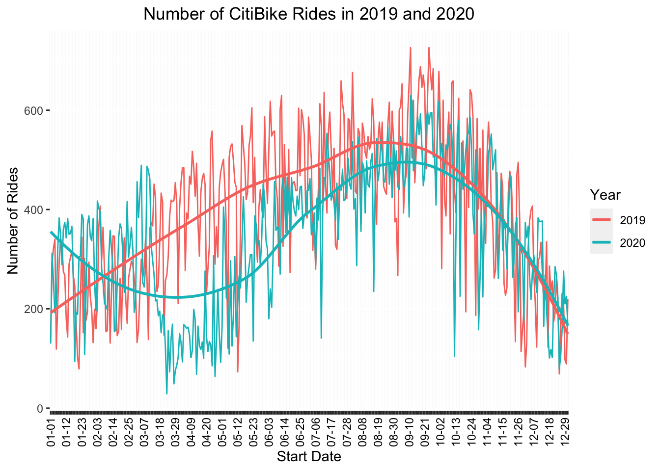
Overall and as expected, there were more CitiBike rides in 2019 during the equivalent month during the peak of the pandemic in 2020.
Average Ride Length per Month
monthly_Q1 <- quantile(pull(manhattan_rides_df, trip_min), probs = 0.25)
monthly_Q3 <- quantile(pull(manhattan_rides_df, trip_min), probs = 0.75)
monthly_inter_quart <- IQR(pull(manhattan_rides_df, trip_min))
monthly_rides_df <-
manhattan_rides_df %>%
filter(
trip_min >= monthly_Q1 - 1.5*monthly_inter_quart,
trip_min <= monthly_Q3 + 1.5*monthly_inter_quart
)
monthly_rides_df %>%
group_by(year) %>%
mutate(
month = month(starttime, label = T)
) %>%
plot_ly(
x = ~month,
y = ~trip_min,
color = ~year,
type = "box",
colors = "viridis") %>%
layout(
boxmode = "group",
title = "Duration of Citibike Rides by Month",
xaxis = list(title = "Month"),
yaxis = list(title = "Trip Duration in Minutes")
)It appears that the overall length of trips in 2019 was more consistent. 2020 had a bump in duration of rides, starting in April. Overall, trip length seems more variable in 2020.
Number of Rides per Month
manhattan_rides_df %>%
group_by(year) %>%
mutate(
month = month(starttime, label = T)
) %>%
group_by(year, month) %>%
summarise(obs = n()) %>%
plot_ly(
x = ~month,
y = ~obs,
color = ~year,
type = "scatter",
mode = "lines",
colors = "viridis") %>%
layout(
title = "Number of Citibike Rides per Month",
xaxis = list(title = "Month"),
yaxis = list(title = "Rides")
)There is a huge drop in monthly trips in April 2020. Lockdown started mid/late March so this coincides with people transitioning to WFH and largely staying inside to minimize contacts. The ride numbers bounce back quite a bit after this, but not to 2019 levels.
# the code below saves trip_min, gender, age_group variables of manhattan_rides_df
trip_dur_age_gender_df <-
manhattan_rides_df %>%
select(trip_min, gender, age_group) # looking at the data we can tell there are massive outliers in trip duration
# so i am going to filter them out using the IQR method
Q1 <- quantile(pull(trip_dur_age_gender_df, trip_min), probs = 0.25)
Q3 <- quantile(pull(trip_dur_age_gender_df, trip_min), probs = 0.75)
inter_quart <- IQR(pull(trip_dur_age_gender_df, trip_min))
trip_dur_age_gender_df <-
trip_dur_age_gender_df %>%
filter(
trip_min >= Q1 - 1.5*inter_quart,
trip_min <= Q3 + 1.5*inter_quart
)Trip Duration by Age and Sex
#this generates a plot of boxplots of trip duration (minutes) by gender and age_group
trip_dur_age_gender_df %>%
mutate(
gender = str_to_sentence(gender)
) %>%
plot_ly(x = ~age_group, y = ~trip_min, color = ~gender, type = "box", colors = "viridis") %>%
layout(
boxmode = "group",
xaxis = list(title = "Age Range"),
yaxis = list(title = "Trip Duration (min)"),
title = "Average Trip Duration (in minutes) in 2019 and 2020 by Age Group and Gender",
legend = list(title = list(text = "<b> Gender </b>"))
)We can see by comparing averages, females take longer rides than males across all age groups. Interestingly though there are more outliers for trip duration among males than females. On average younger riders take longer rides compared to older riders.
Average Age of CitiBike Riders by Sex
# this dataframe groups rides by gender and month
# and provides the average age for each gender in that month
# along with the standard deviation, standard error, lower bound, and upper bound
# which are then used to create a plotly graph where we get average age per month for each gender
# with 95% confidence bands around each line
avg_age_per_month_df <-
read_csv("manhattan_rides.csv") %>%
mutate(
date = floor_date(as_date(starttime), "month")
) %>%
select(date, gender, age) %>%
group_by(date, gender) %>%
summarize(
total = n(),
avg_age = mean(age),
sd_age = sd(age)
) %>%
mutate(
sem = sd_age/sqrt(total - 1),
lower_bound = avg_age + qt(0.025, df = total - 1) * sem,
upper_bound = avg_age - qt(0.025, df = total - 1) * sem
) %>%
ungroup()
avg_age_plot <-
avg_age_per_month_df %>%
mutate(
gender = str_to_sentence(gender)
) %>%
ggplot(aes(x = date, y = avg_age, color = gender)) +
geom_line(size = 1, alpha = 0.8) +
geom_ribbon(aes(ymin = lower_bound, ymax = upper_bound), alpha = 0.2)
ggplotly(avg_age_plot) %>%
layout(
xaxis = list(title = "Date"),
yaxis = list(title = "Age"),
title = list(text = "Average Age of CitiBike Riders in 2019 and 2020 by Gender", font = list(size = 16)),
legend = list(title = list(text = "<b> Gender </b>"))
)We see from this graph that across 2019 and 2020, the average age of male and female riders follow the same general trajectory. At all time points over this period, the average age of female riders is younger than the average age of male riders. The biggest age discrepancies appear in the summer months of both 2019 and 2020.